2×2 Insights from MAPS 2020
Consultants tend to favour a good 2X2 matrix, as this simple four quadrant box is a great way to visualise data.
It puts a great deal of information into an easy to read format and clusters companies, ideas, concepts or individuals into homogenous groups. It is a simple, yet elegant way to communicate complex relationships in data.
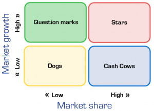
The most famous, of course, is the Boston Consulting Group’s growth share matrix, created in 1968. Harvard Business Review went so far as to give it first place in its ‘Charts that changed the world’.
Boston Consulting Group’s Growth Share Matrix
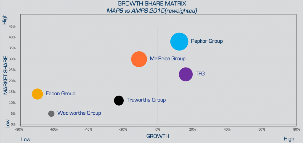
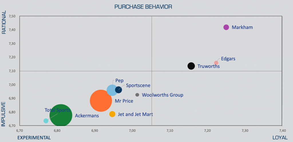
There are numerous variables you can use to create 2X2s in the new MAPS data. We copied the BCG one above for an analysis on retailers. The chart used the 2015 AMPS compared to 2020 MAPS to get the Y axis “Market Growth” which illustrated the change in number of customers who say they shop at that store over the 5 year period. We created another one that had Impulsive vs Rational shoppers on one axis and Experimental vs Loyal on the other.
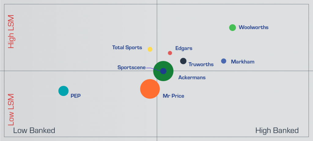
In the visualisation below, we are looking at retailers by the percentage of shoppers who are high LSM on one axis and by the percentage of shoppers who are banked on the other axis to show how the retailers are placed on those two metrics.
LSM vs Banked Status for customers of clothing retailers
What you can draw from this visualisation is that Woolworths has both high LSM and highly banked customers, Markham has mid LSM but highly Banked, and Pep has lower LSM and low banked customers, with the others making up the average. Total Sports is higher LSM but less likely to be banked, perhaps because of its young clientele.
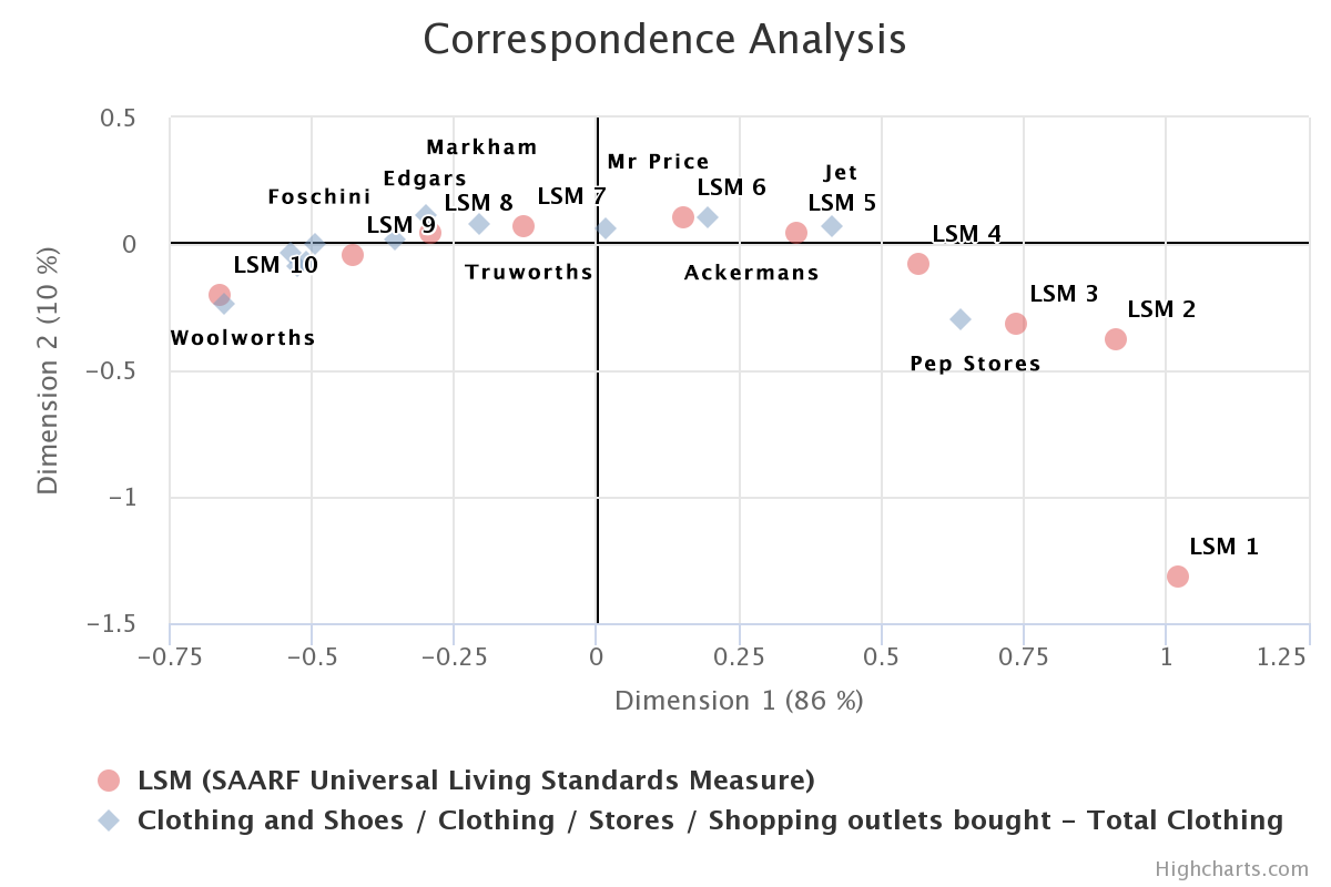
We had to construct this chart in Powerpoint but you can get a similar insight by using the Correspondence Plot visualisation in our Data Portal.
Sign up for a free trial of the Data Portal
Contact us for more guidance on how to get the best insights from your data.
